Now that we know about the basics and about the advance features of the styled-components we will be building a simple application with dark and light theme. I have setup an application using create-react-app and have deleted all the boilerplate code. All that remains in the src directory now is:
- App.js
- index.css
- index.js This is what it looks like inside these files.
// index.js
import React from "react";
import ReactDOM from "react-dom";

import "./index.css";
import App from "./App";

ReactDOM.render(<App />, document.getElementById("root"));
/* index.css */
:root {
  --light: #f6f8fa;
  --dark: #24292e;
  --text: #fff;
  --blue: #0066ff;
  --blue-dark: #2188ff;
  --green: #28a745;
  --green-dark: #34d058;
}
and inside the App.js is all of our application. So I will be explaining it little by little.
Defining Light And Dark Theme
Inside the App.js file i created two variables that are assigned to an object containing theme properties. These two vars are:
const theme = {
  background: "var(--light)",
  text: "var(--text)",
  primary: "var(--blue)",
  secondary: "var(--green)",
};

const darkTheme = {
  background: "var(--dark)",
  text: "var(--text)",
  primary: "var(--blue-dark)",
  secondary: "var(--green-dark)",
};
These vars will inject css variables that we defined in the index.css file that we mentioned above.
Styling Main and Button
Below those two theme objects we define styles for two tag, main and button.
const Main = styled.main`
  width: 100vw;
  height: 100vh;
  display: flex;
  flex-direction: column;
  justify-content: center;
  align-items: center;
  background-color: ${props => props.theme.background};
`;

const Button = styled.button`
  padding: 0.5rem 1rem;
  margin: 0.5rem;
  font-weight: 600;
  border: 1px solid ${props =>
      props.green ? props.theme.secondary : props.theme.primary};
  background-color: ${props =>
    props.green ? props.theme.secondary : props.theme.primary};
  color: ${props => props.theme.text};
`;
As you can see that these tags render background color and border color based on the theme color provided to them.
Theme
Now here comes the main part. We know render those components and will define the logic of our application and how we will render light and dark theme.
Here first of all we use useState hook with the default value of true. This then later is used in the ThemeProvider to tell if to use the light theme variables or dark ones wether if the isLight variable true or not.
function App() {
  const [isLight, setLight] = useState(true);

  return (
    <ThemeProvider theme={isLight ? theme : darkTheme}>
      <Main className="App">
        <Button onClick={() => setLight(!isLight)}>
          {isLight ? "Dark" : "Light"}
        </Button>
        <Button onClick={() => setLight(!isLight)} green>
          {isLight ? "Dark" : "Light"}
        </Button>
      </Main>
    </ThemeProvider>
  );
}
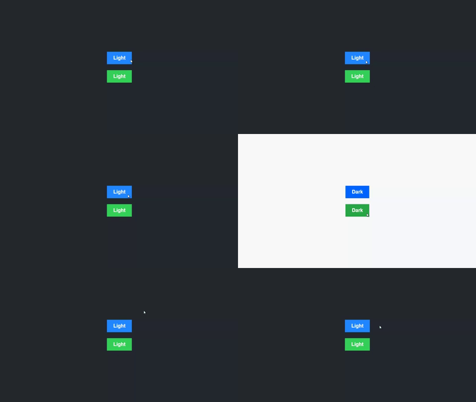
Down there are two button with one color blue and other green. These buttons are also rendering text inside them Button Dark if the isLight variable is true else it will render text Light inside the button. After all this it works like this.

Hope you learned something new. See you all next time.
 zainsci