In the last post we learned about the Basics of Styled Components and now we are gonna look at the Advance features of Styled Components mainly about how we can have a Theming support in React with Styled Components.
Theming
To use styled-components theming support we have to wrap our application with the ThemeProvider component which will let all the components under the ThemeProvider to have access to theme variables. Under the hood ThemeProvider uses react contect API so even if a component is deeply nested in the tree of components, it can have access to the theming variables.
Now lets experiment with this by creating a reacreaing the Button component from the last post But this time the Button appearence will depend on the theme of the app.
const Button = styled.button`
  padding: 0.5rem 1rem;
  margin: 0.5rem;
  font-weight: 600;
  color: var(--white);
  background-color: ${props => props.theme.main};
  border: 1px solid ${props => props.theme.main};
  border-radius: 0.5rem;
`;

// This sets the default theme
// for Button components
Button.defaultProps = {
  theme: {
    main: "var(--blue)",
  },
};

// These are the custom theme
// Variables that we create
const theme = {
  main: "var(--purple)",
};

return (
  <>
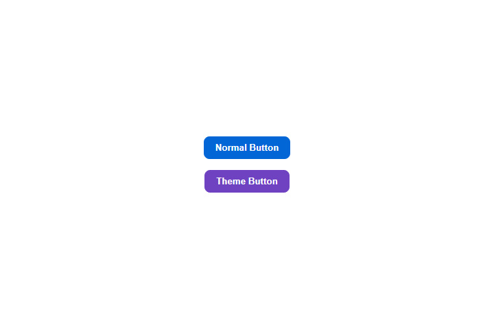
    <Button>Normal Button</Button>
    <ThemeProvider theme={theme}>
      <Button>Theme Button</Button>
    </ThemeProvider>
  </>
);
Note that we are assigning an object with a theme object inside to the Button.defaultProps. These styles will be rendered if there are no theme vaiables provided. First button will have this background color as it is outside the scope of ThemeProvider.

Function Themes
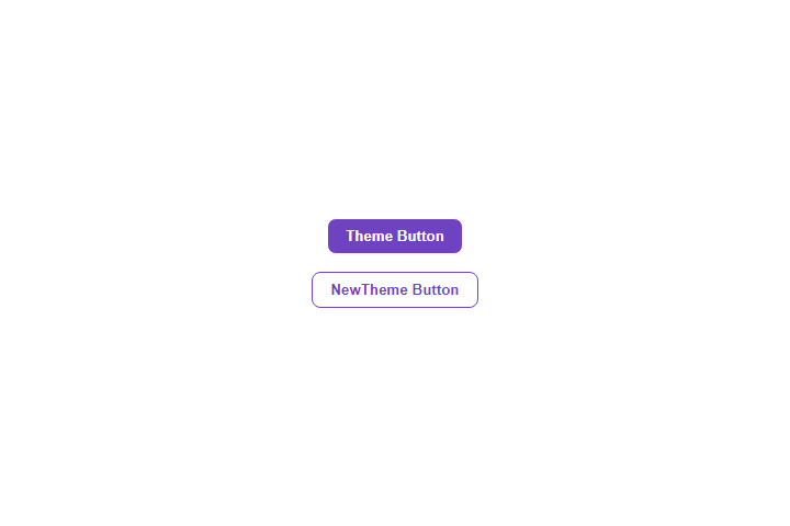
We can also pass functions to the theme prop inside the ThemeProvider component and this function will have access to object that we pass as a prop to the parent ThemeProvider component. We can use this to customize the theme inside another theme as we want.
const Button = styled.button`
  padding: 0.5rem 1rem;
  margin: 0.5rem;
  font-weight: 600;
  color: ${props => props.theme.secondary};
  background-color: ${props => props.theme.main};
  border: 1px solid ${props => props.theme.secondary};
  border-radius: 0.5rem;
`;

const theme = {
  main: "var(--purple)",
  secondary: "var(--white)",
};

const newTheme = ({ main, secondary }) => {
  return {
    main: secondary,
    secondary: main,
  };
};

return (
  <>
    <ThemeProvider theme={theme}>
      <Button>Normal Button</Button>
      <ThemeProvider theme={newTheme}>
        <Button>Theme Button</Button>
      </ThemeProvider>
    </ThemeProvider>
  </>
);

The Theme Prop
A theme can also be directly passed to a component using the theme prop. This can override the theme provided by the ThemeProvider.
const theme = {
  main: "var(--purple)",
  secondary: "var(--white)",
};

return (
  <>
    <ThemeProvider theme={theme}>
      <Button>Normal Button</Button>
      <Button theme={{ main: "var(--white)", secondary: "var(--purple)" }}>
        Theme Button
      </Button>
    </ThemeProvider>
  </>
);
I think this is all we need to build a dark and light theme application using react and styled components.
 zainsci